Video Transcripts
简体中文版的视频文案请参阅此文章。
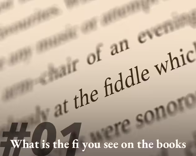
Have you ever noticed, in some books, magazines or newspapers, and even on screens, you can always find these kinds of linked characters? So, what are these things? Are they some sort of printing or rendering errors How were these things created? And what's the purpose of their usage?
Greetings, I’m Steven. This series will introduce some knowledge of typeface designing and typography to you. Okay, let's begin!
These kinds of linked characters named Ligatures in typography. Ligature from Latin ligātus means “to tie, bind”. A ligature occurs where two or more letters are joined to form a single glyph.
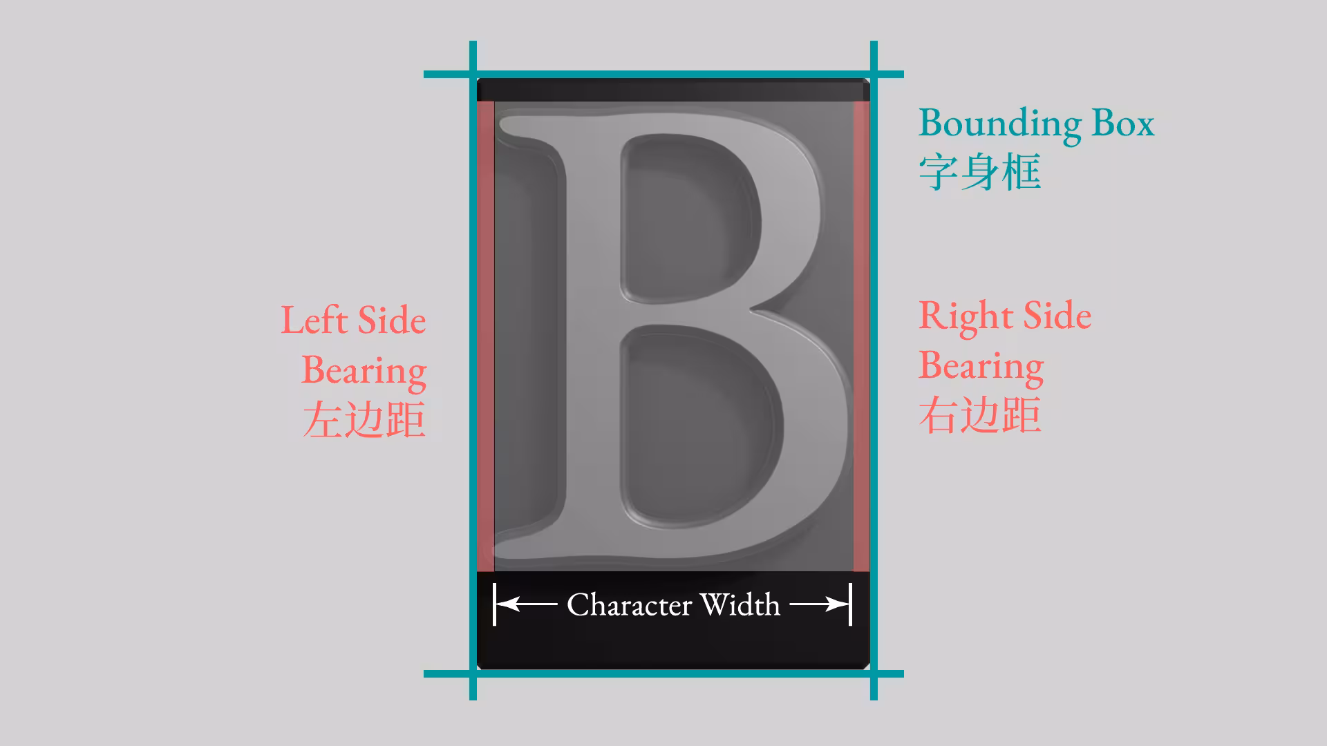
Let’s date back to the ages when typesetting was the dominant printing method. Take a look at this metal type, I’ll flip it first for the demonstration. The letter sits in a rectangular space we call the bounding box. The width of this box includes the width of the glyph and side bearings. These side bearings help to keep the spacing between the letters looking just right in the ideal situation.
However, certain letters such as f or T, A, V, can cause these huge visual gaps between the letters and reducing the readability because of their shape. Allowing a portion of the glyph to extend beyond the body can be a solution. And the overhanging part is called kern. But this can cause the collision between the adjacent letters, making them impossible to align neatly.
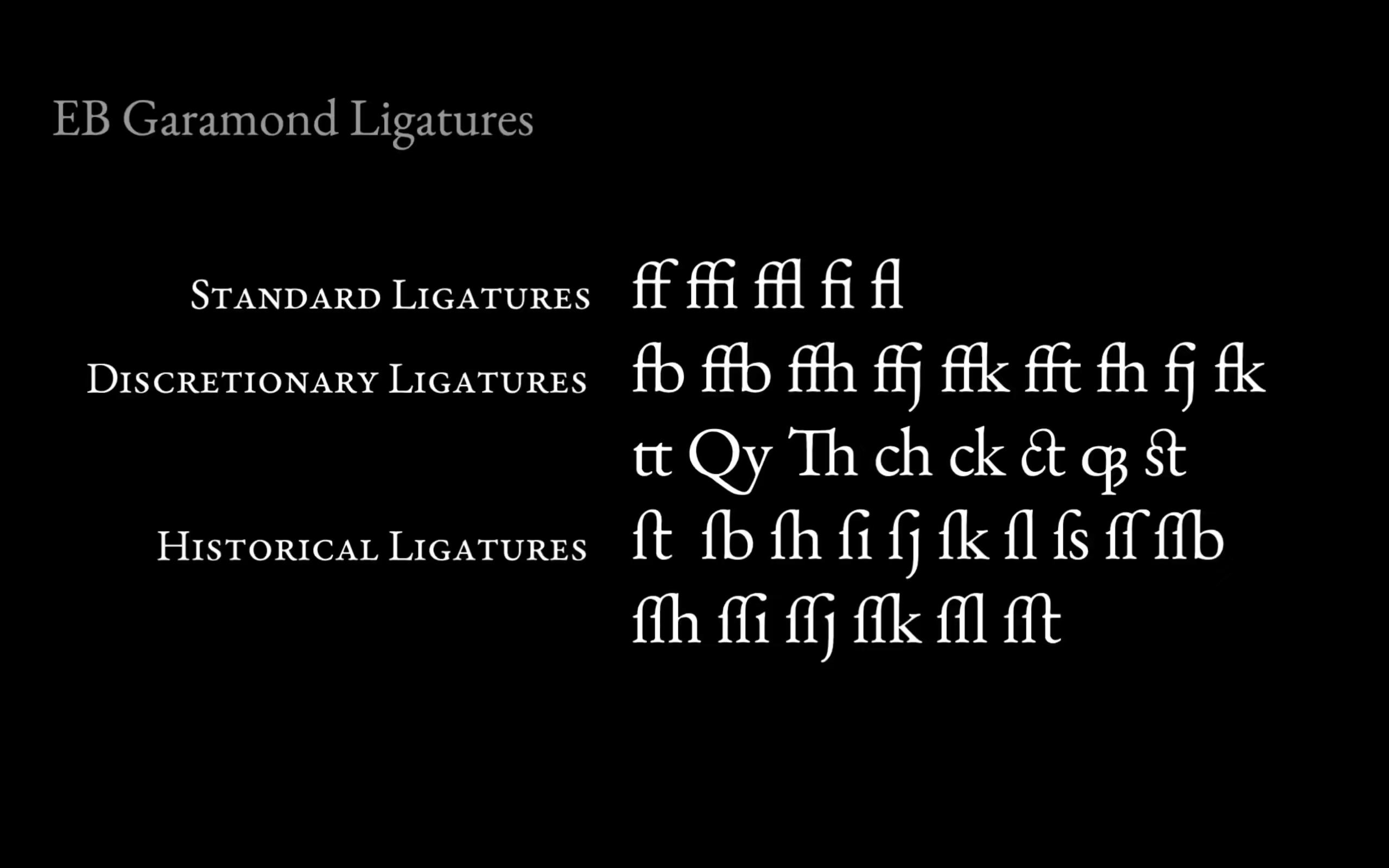
To solve this problem, the designers cast frequently used letter combinations, such as fi, fl, as individual metal type pieces. This practice gives rise to the ligatures. It not only enhanced visual harmony but also simplified the typesetting workflows. It quickly became popular and endures in modern digital design.
In contemporary typography, ligatures had evolved their original role of eliminating unsightly collisions and improving readability. They now serve as stylistic design elements. Powered by OpenType technology, designers can create not only standard ligatures but also various ligature functions—all meeting sophisticated typographic needs. Beyond simply connecting letters, modern ligatures do the opposite: enable subtle adjustments to adjacent glyphs, preventing visual clashing while maintaining cohesive word shapes.
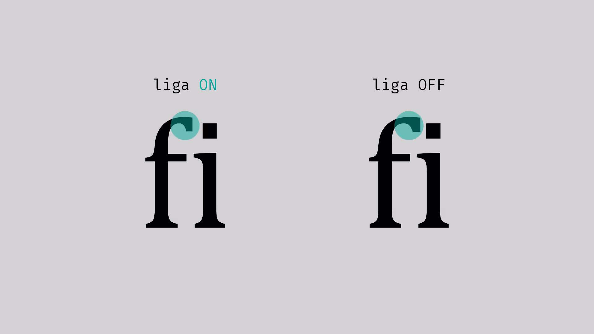
In many modern programming fonts, more and more type foundries are highlighting their support for various OpenType features as a selling point. One common approach is to alter the glyphs of frequently repeated symbols to improve the distinction between similar-looking content or to make repeated characters easier to count. Some fonts also enhance the readability of symbol combinations—for example, by rendering exclamation mark plus equal sign != as a widened, double-width not-equals sign != for clearer recognition.
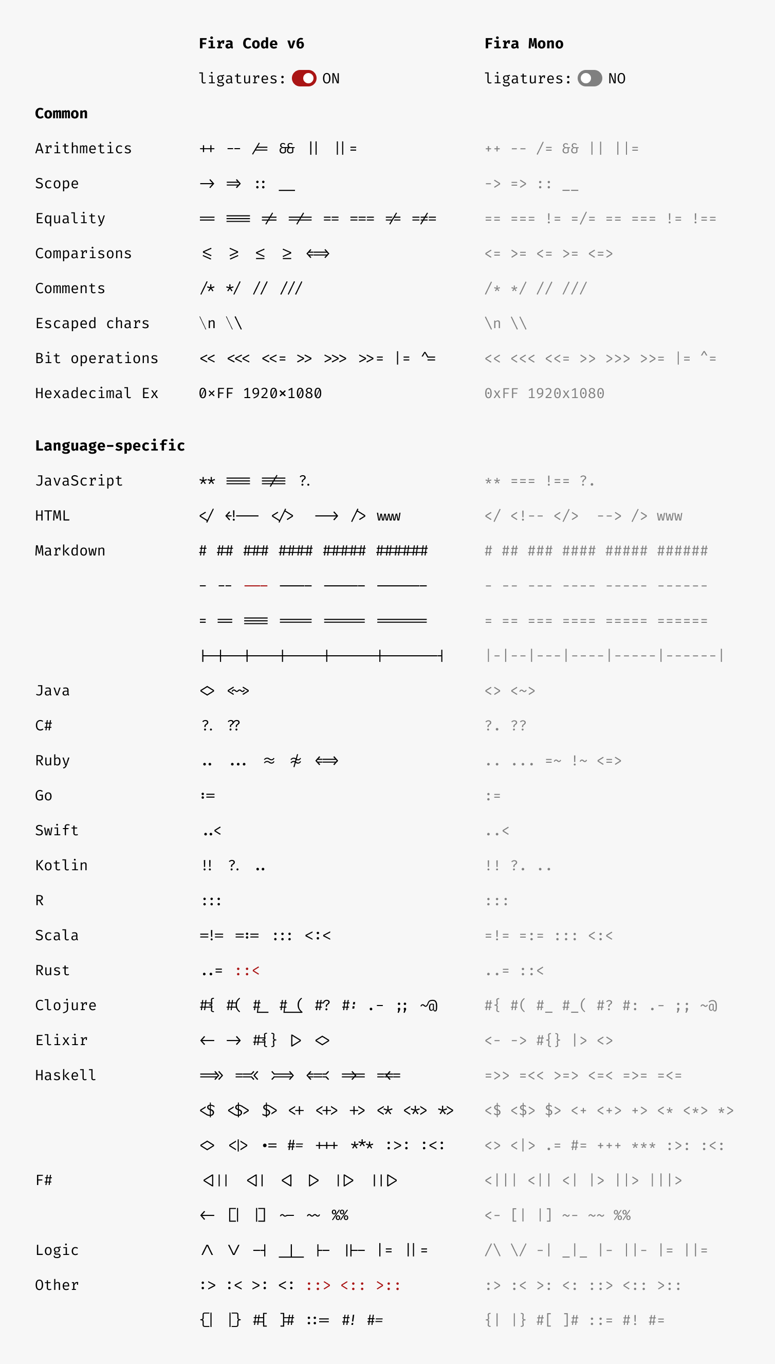
The ligatures mentioned above originate from typographic practices, where their function is purely aesthetic and technical in font design and typesetting, without altering the semantic meaning of the text. These are therefore termed typographic ligatures.
In contrast, another category exists, orthographic ligatures. These are not mere connected forms of two letters, nor can they be mechanically split back into their original components. Instead, they evolve into entirely new letters. The most iconic example is the letter W, whose name reflects its origin: called Double-U in English and Double-V in French. The origin of this letter won’t be discussed here today. So, if you are interested in this series, please leave a like and click subscribe. Comment below and let me know your ideas.
Another notable case is the German eszett (ß) or Sharp S. Although the name eszett, phonetically suggests a combination of Es and Zett, it is often written as a ligature of the long s (ſ) and round s (s). Tracing its roots, this character emerged from the Late Medieval and Early Modern German digraph ⟨Sz⟩, which in Gothic typography was stylized as a long s followed by a tailed z (ſʒ). So why is it written in combination of longs s plus round s today?

Between the 3rd and 8th centuries AD, a significant phonetic shift occurred in Germanic languages known as the High German Consonant Shift. During this period, the West Germanic dialects that underwent the shift gradually evolved into Old High German, distinguishing themselves from non-shifted variants. The Proto-West Germanic voiceless stops /p/, /t/, and /k/ shifted to fricatives or affricates like /t͡s/, /p͡f/, and /x/.
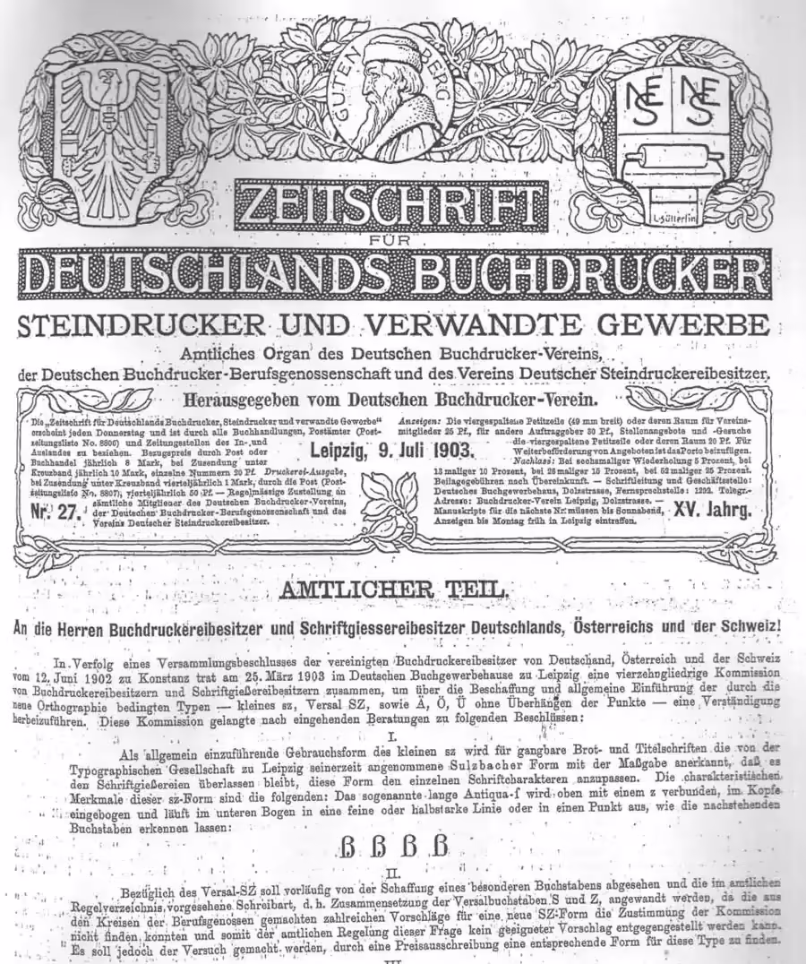
However, due to the continued use of the Latin alphabet for written German, this led to inconsistencies such as multiple sounds represented by a single letter or multiple spellings for a single sound, with letter usage largely dictated by personal preference. In the original alphabet, the letter ⟨z⟩ represented both /t͡s/ and /s/. By the 13th century, ⟨s⟩ gradually became voiced as /z/, necessitating a distinction. Consequently, /s/ began to be denoted by ⟨ss⟩ or the digraph ⟨sz⟩. In Western typography, the ligature ſs (long s + round s) had long existed, but initially served purely as a typographic convention.
The pivotal moment came in July 1903, when the Leipzig Typographic Society officially adopted the Sulzbacher form as the foundational design for the Eszett (ß). This marked ß’s formal entry into the German alphabet. Finally, in 2017, the German Orthographic Council standardized the uppercase form, cementing ß’s definitive role in German orthography.
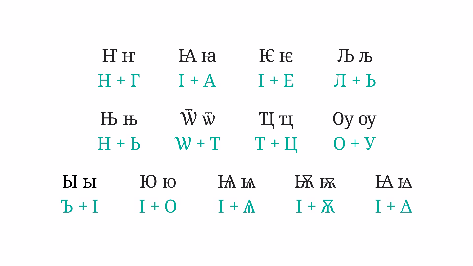
In contrast, the status of the digraph ⟨IJ⟩ in Dutch remains unresolved. Although the Dutch Language Union and many dictionaries recommend using ⟨i⟩ + ⟨j⟩ directly, it often behaves as an orthographic ligature in practice: when capitalizing initials, the entire ⟨ij⟩ is converted to uppercase; in Dutch crossword puzzles, they occupy a single square; on some typewriters, ⟨IJ⟩ has a dedicated key; The sign of Rijksmuseum designs it in this form; and many fonts design ⟨ij⟩ as a ligature. Unicode code points U+0132 and U+0133 explicitly name its uppercase and lowercase forms as ligatures. These factors undeniably reinforce the grapheme’s unified identity.
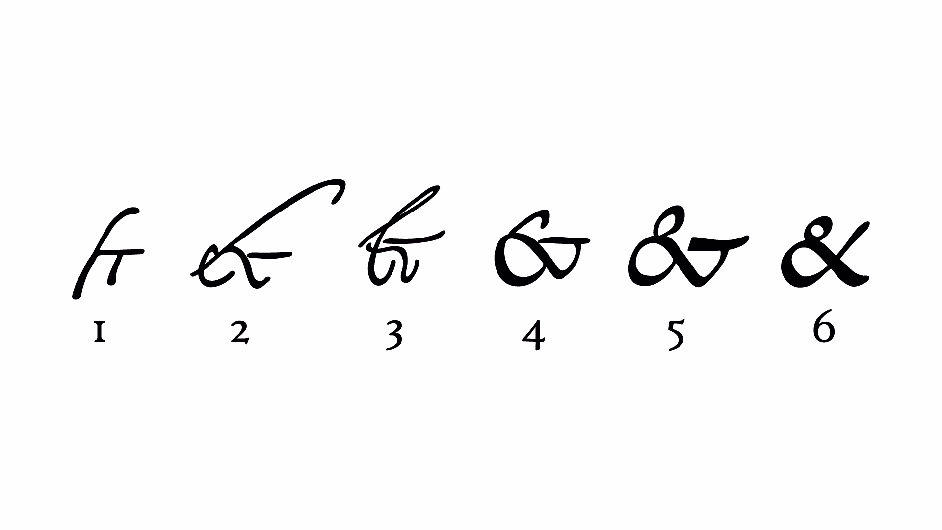
The evolution of ligatures is not limited to forming standalone letters. Over the course of history, frequently used letter combinations have gradually transformed into symbolic forms. A prime example is ampersand (&), which signifies “and” and originates from the Latin et. Similarly, the number sign evolved from the Latin abbreviation libra pondo (℔). Additionally, currency symbols, alchemical symbols, and astrological signs also trace their origins to letter ligatures.
Ligatures are not exclusive to Latin scripts. Greek manuscript traditions included numerous ligatures, and influenced by this practice, early Greek printed works preserved such stylistic conventions. Today, Unicode still encodes ligatures like ⟨ϗ⟩U+03D7and ⟨ϛ⟩U+03DB. Cyrillic orthography also features many orthographic ligatures, most of which are included in Unicode. In Arabic, ligatures are indispensable—proper text rendering on screens requires extensive OpenType features. In East Asia, historically vertical Japanese writing employed ligatures or combined characters, though only a few are encoded today, such as hiragana yori「ゟ」U+309F and katakana koto「ヿ」U+30FF.
Let us return to the opening question: What purpose do these ligatures serve? Beyond mere aesthetic pursuit, they are akin to DNA’s double helix—typographic and orthographic ligatures twist, soar, and waltz through time, etching their intricate dance into the annals of history. Through them, we glimpse the evolution of human language itself.
Though many typographic ligatures faded with the rise of phototypesetting and desktop publishing in the 20th century, OpenType rekindled their dance. Now, in the quiet spaces between letters, in the breath of every word, these humble symbols thread together the continuum of human expression—silent yet sovereign, they carry forward the unbroken story of who we are.
References
Books & Manuscripts
- Aristotle. Nicomachaen Ethics. Basel: Johannes Oporin und Eusebius Episcopius, 1566.
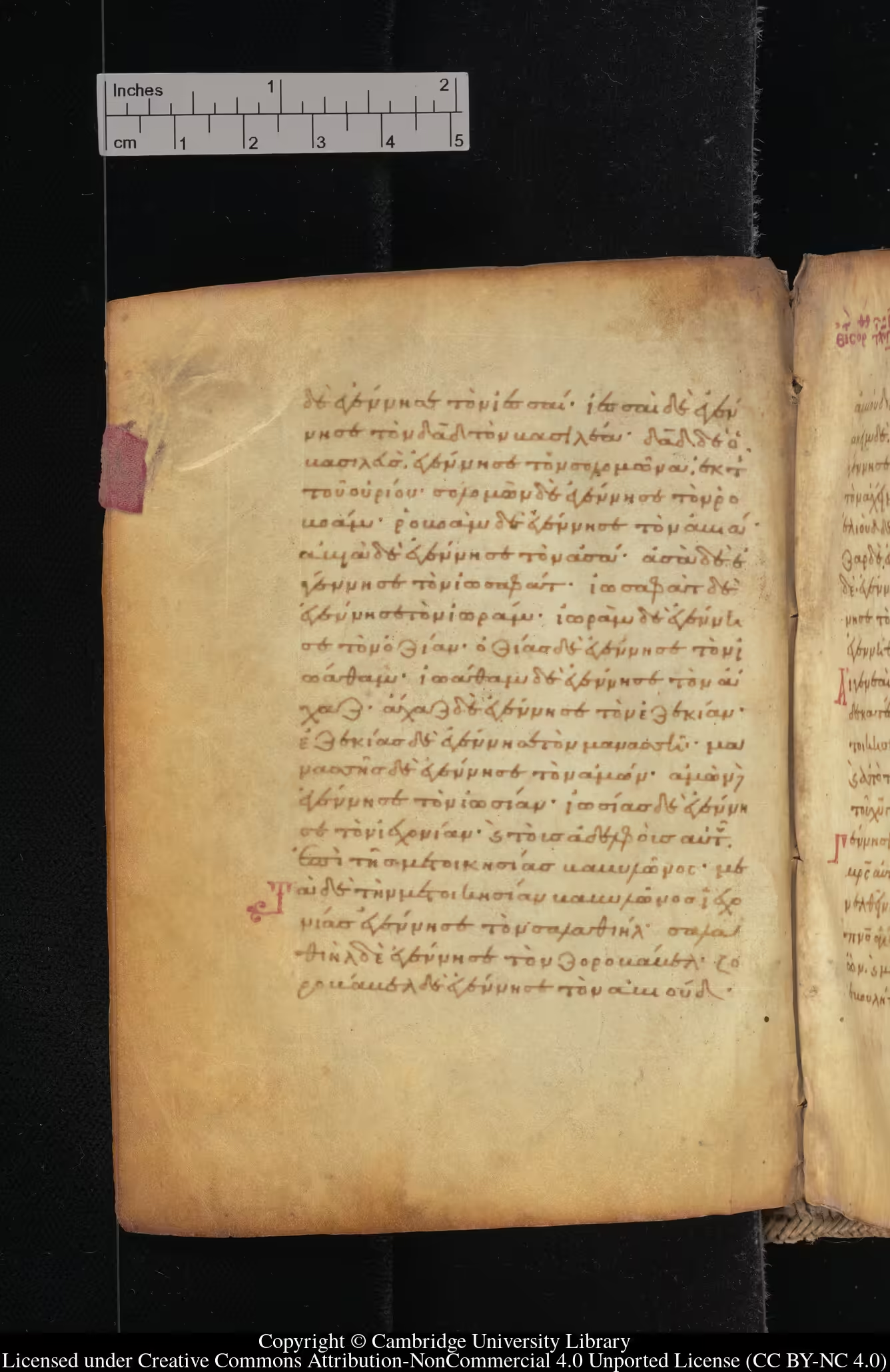
- Greek Lectionary. Cambridge University Library, MS Add. 679.
- Arrighi, Ludovico degli. La operina di Ludouico Vicentino, da imparare di scriuere littera cancellarescha, 1524.
- Zeitschrift für Deutschlands Buchdrucker Steindrucker und Verwandte Gewerbe, 1903.
Articles & Columns
- Ralf Hermann. “Typographic Myth Busting: What’s a Ligature, Anyway?”. Typography.guru, Nov 20, 2012.
- AMB. “The High German Sound Shift”. The Bʰlog, Apr 28, 2014.
- Zui. “The Story of Eszett (ß)”. The Language Closet, Nov 5, 2022.
- Siphercase. “万『字』皆可『连』 (影片文案)”. 遠見齋, 2023.
Wikipedia & Wiktionary Entries
- “Ligature (writing)”. Wikipedia, 2025.
- “ß”. Wikipedia, 2025.
- “High German consonant shift”. Wikipedia, 2025.
- “IJ (digraph)”. Wikipedia, 2025.
- “Ampersand”. Wikipedia, 2025.
- “Number sign”. Wikipedia, 2025.
- “Currency symbol”. Wikipedia, 2025.
- “Alchemical symbol”. Wikipedia, 2025.
- “ligature”. Wiktionary, 2025.
- “合略仮名”. Wikipedia, 2025.
Documentations & Forums
- FontForge Project. “6.2. Creating a Ligature”. FontForge Documentation.
- Topp-Thema: “Eszett als Großbuchstabe”. Typografie.info, Mar 8, 2003.
- Fira Code. “Fira Code: free monospaced font with programming ligatures”.
- “Regeln und Wörterverzeichnis”. Deutsche Rechtschreibung, 2017.